Fruit2o
Packaging Redesign & Launch Strategy
The Brief:
Reposition Fruit2o Plus for a younger audience, modernize the look, sharpen the name, and build a launch strategy.
The Problem:
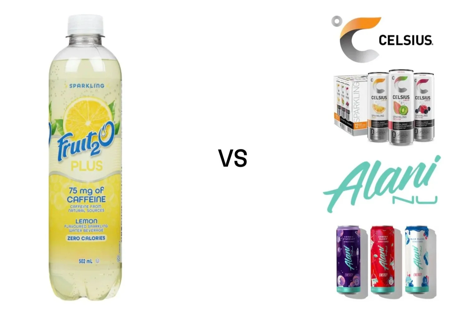
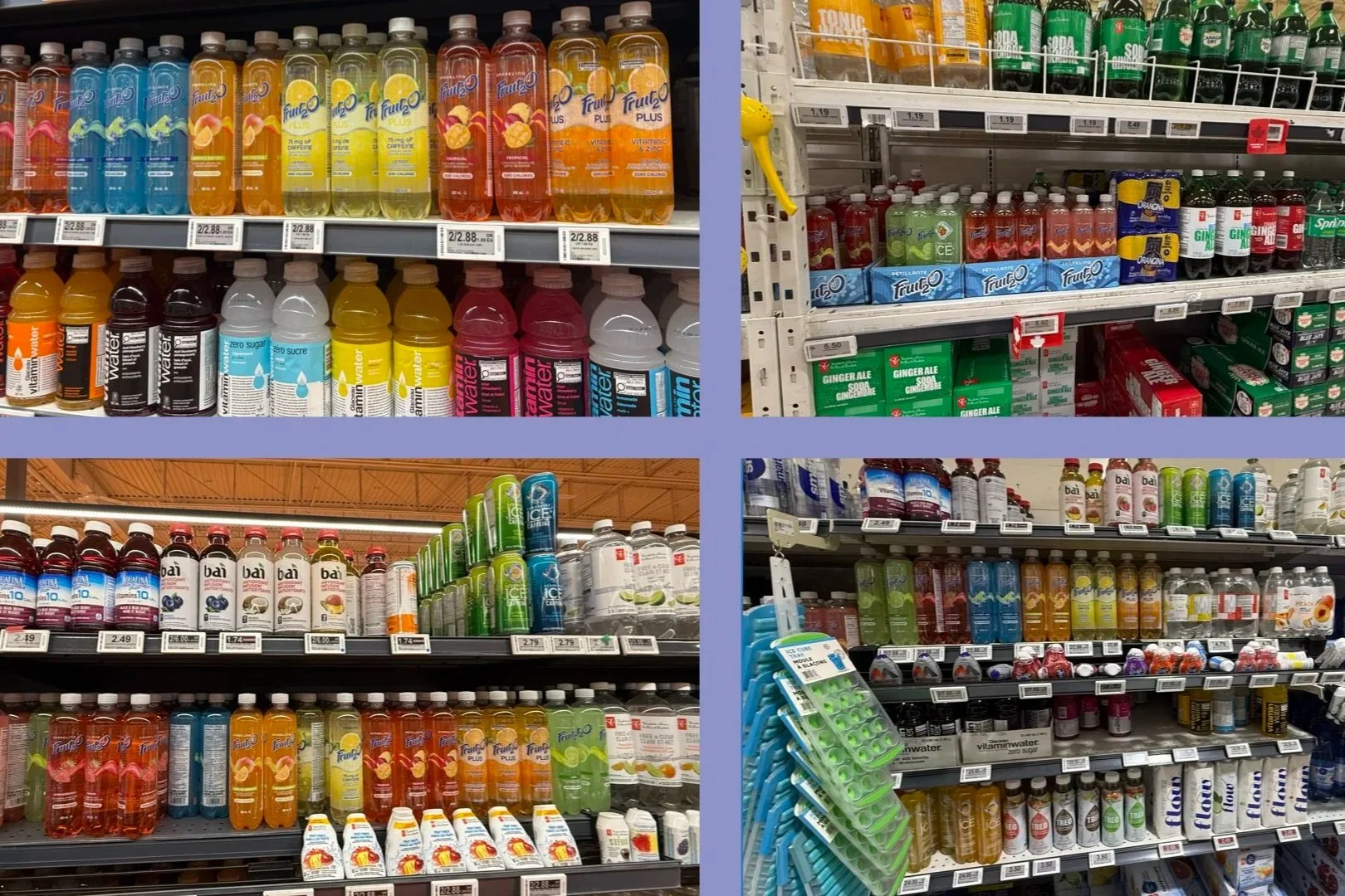
Fruit2o Plus looked outdated next to brands like Celsius and Alani Nu. The packaging appeared yellowed even when it wasn't, the name "Plus" said nothing about caffeine or energy, and most stores on Fruit2o's own site regularly had it out of stock.
The Insight:
Every brand in this category is chasing the same fitness-conscious buyer with performance messaging and bold packaging. Nobody was speaking to the person who wants energy for their life, not their workout. That was the gap.
The Solution:
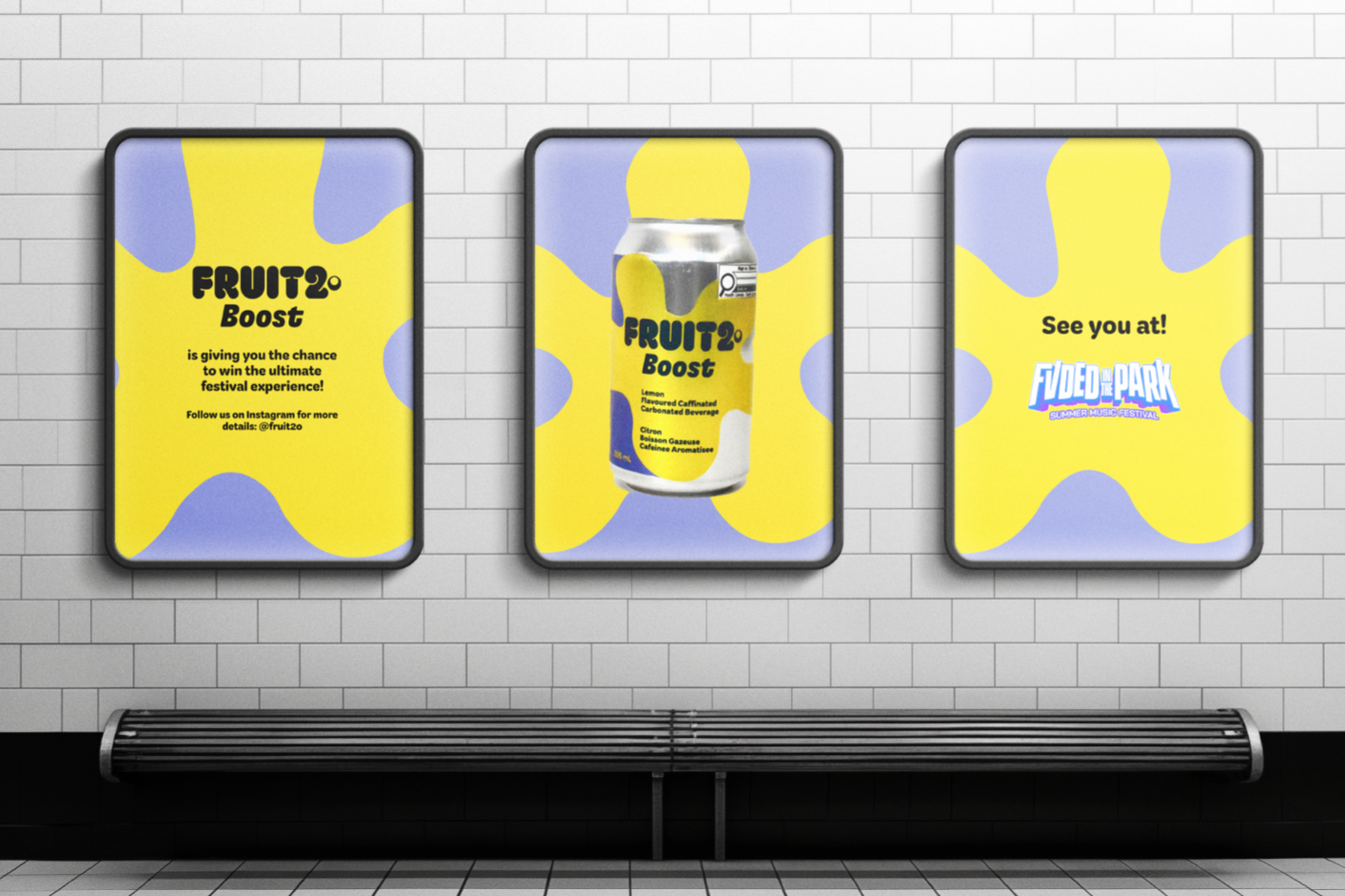
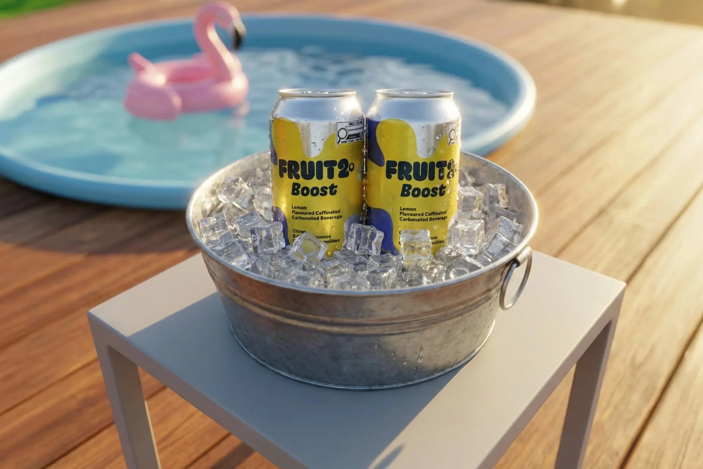
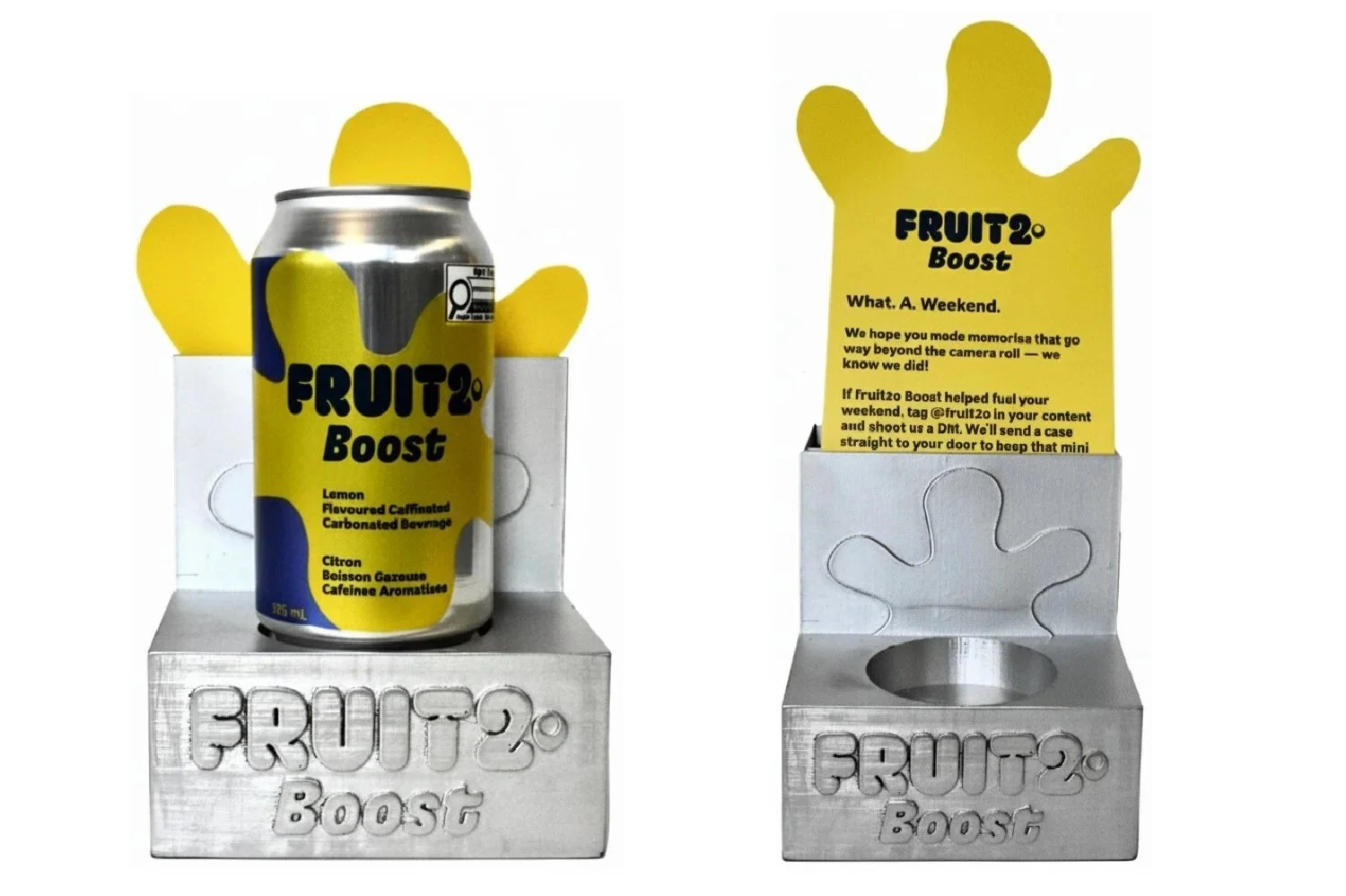
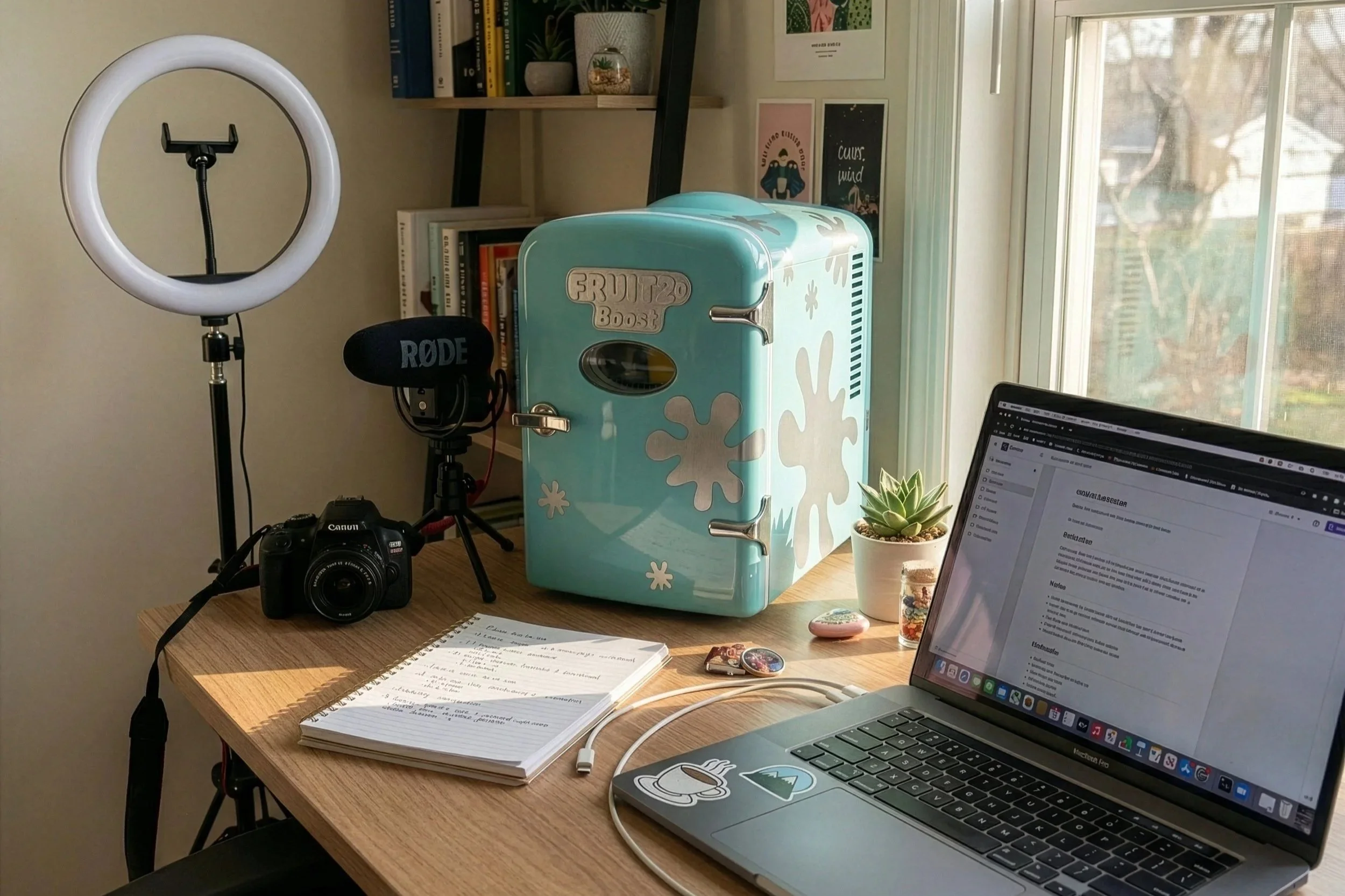
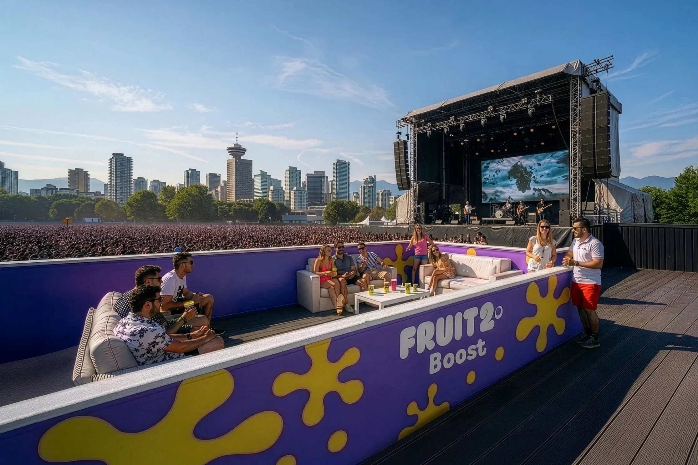
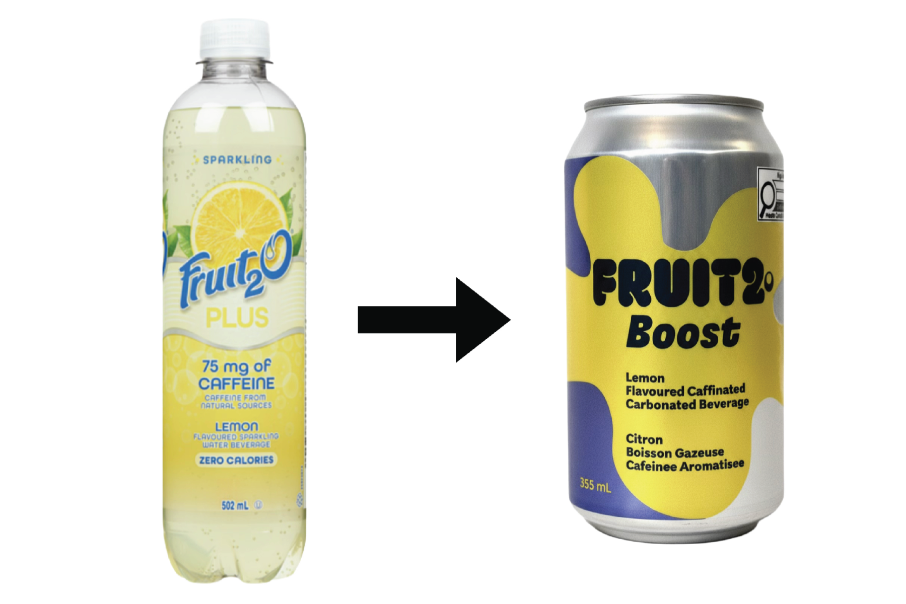
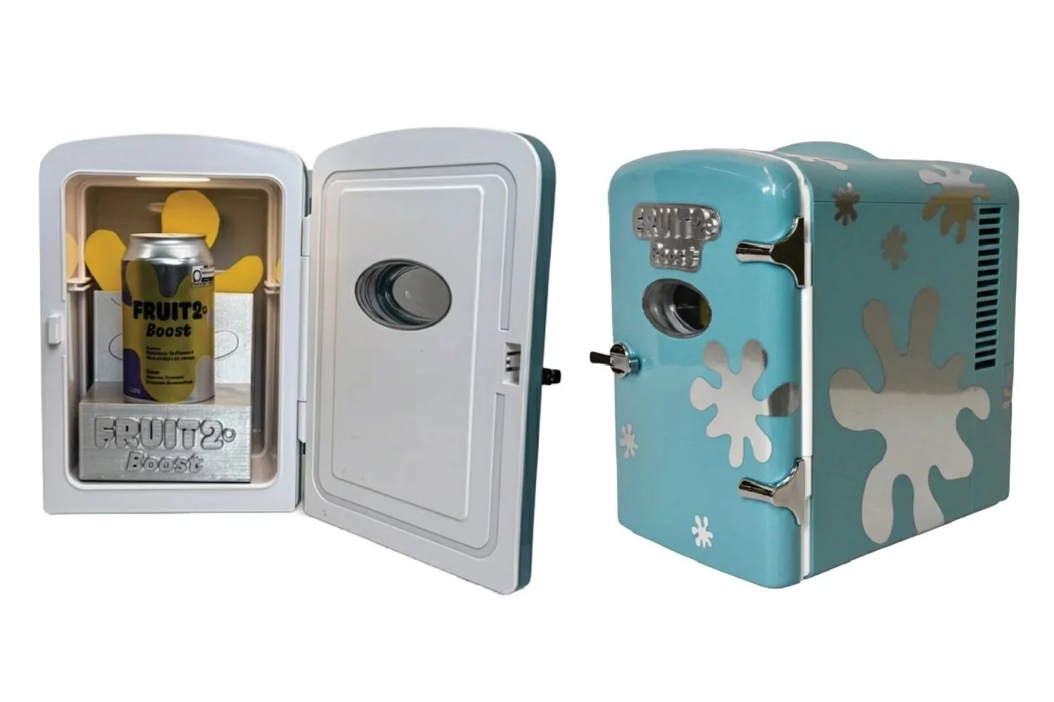
The product was renamed Fruit2o Boost and moved to an aluminum can, a format that signals energy drink rather than grocery aisle water. The splash shape let the metal show through, which became a signature part of the look across the whole brand system. Most cans are fully covered. This one wasn't. The launch centred on a branded viewing deck at FVDED in the Park in Vancouver, with influencers and creators invited directly and festival goers able to win access by buying a can on-site. Guests left with a branded mini fridge PR package designed to keep the brand present long after the weekend ended.