Jamieson Vitamins
Brand Repositioning & Packaging Redesign
The Brief:
Reposition Jamieson for a younger audience without losing the trust that's kept it on shelves for over a century.
The Problem:
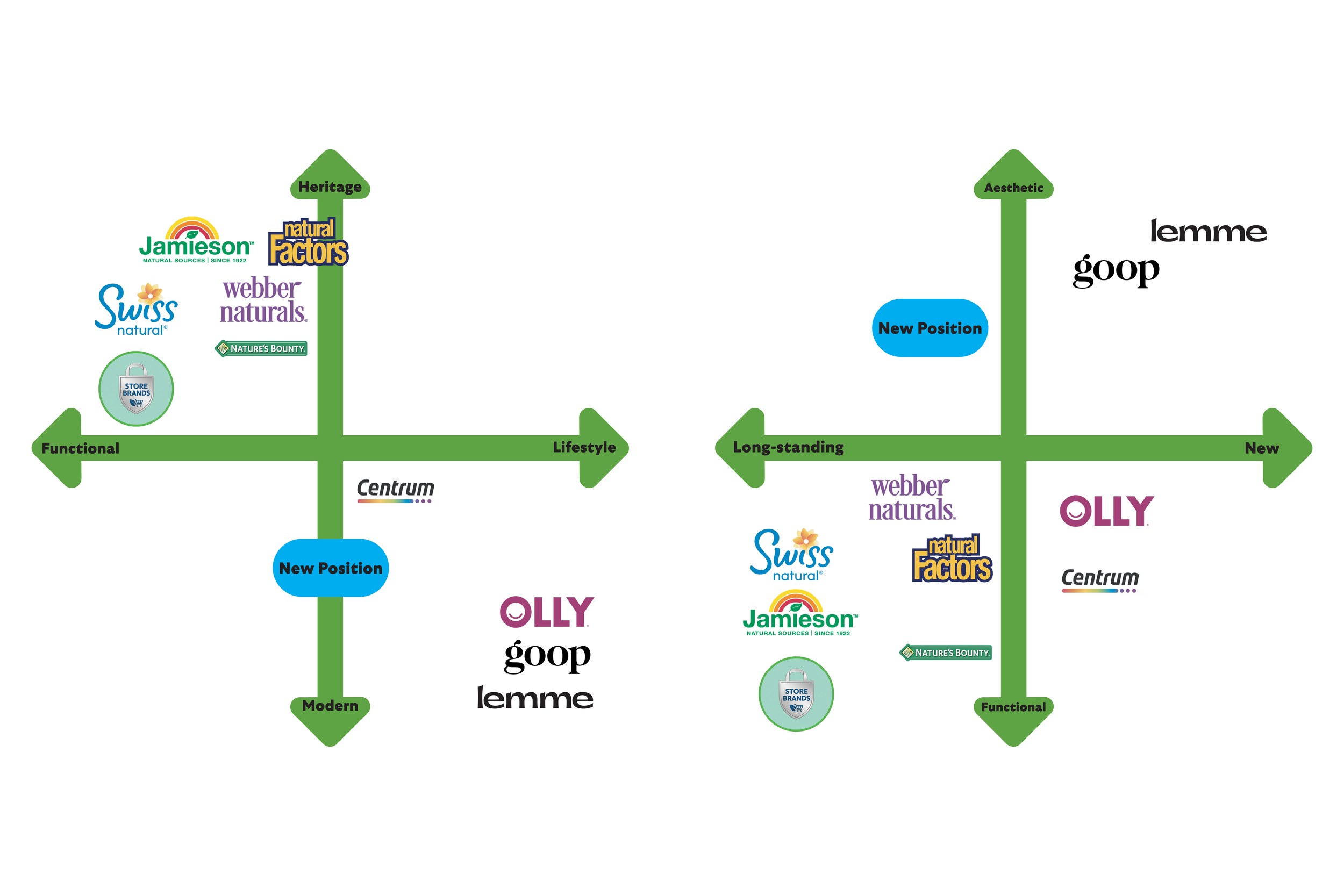
After retail visits and a competitive audit, it was clear Jamieson had drifted into the wrong company. Visually, it was sitting alongside Swiss Naturals and Nature's Bounty: low-cost, utilitarian, easy to overlook. For a brand with real heritage and credibility, that was the wrong position to be in. The category was crowded, and most of it looked the same.
The Insight:
Younger consumers are spending more on wellness, but they're drawn to brands that feel like them. Brands like Lemme were winning by being aspirational and personality-led. Jamieson couldn't (and shouldn't) compete on that. What it had that those brands didn't was 100 years of Canadian trust. That was the opening.
The Solution:
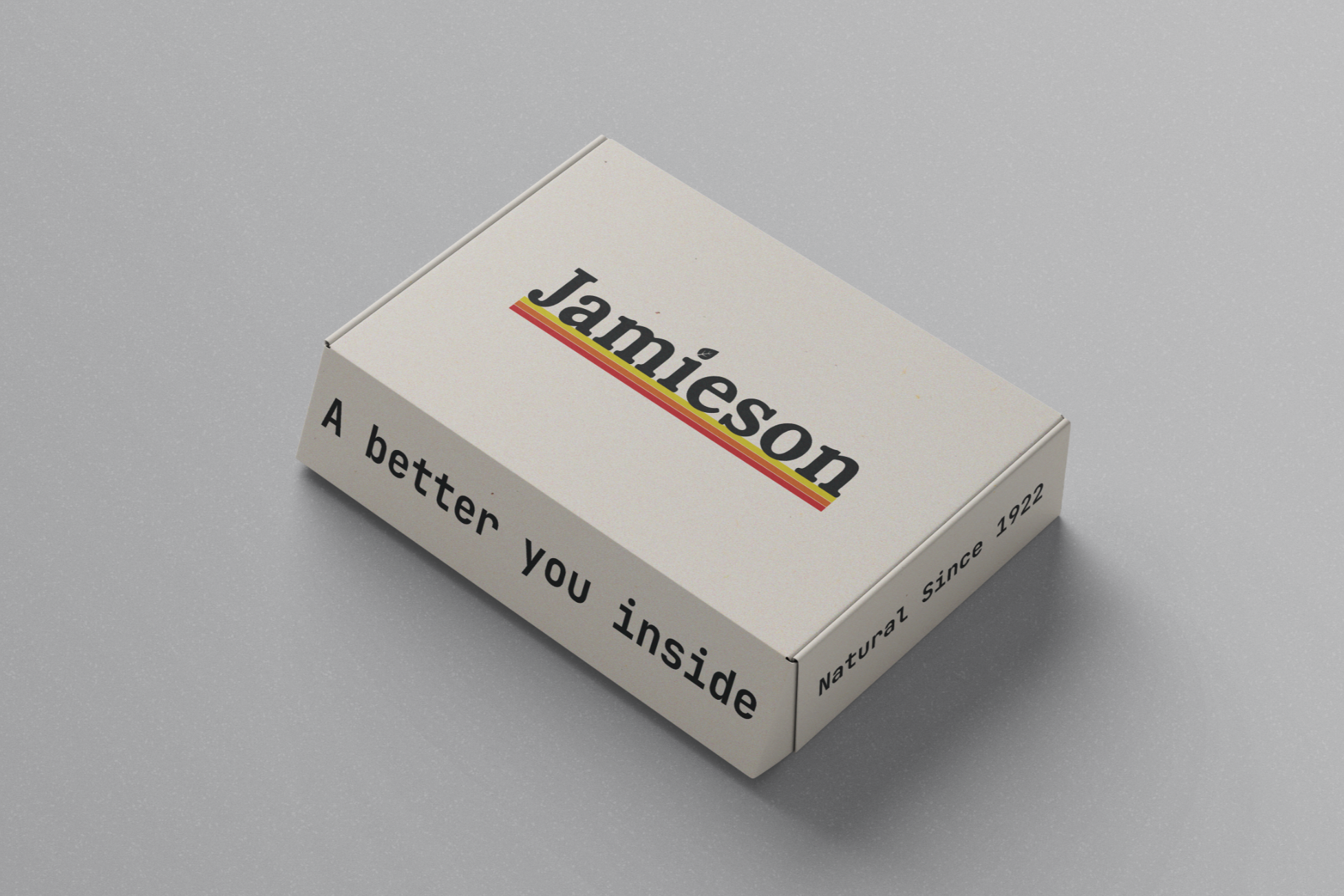
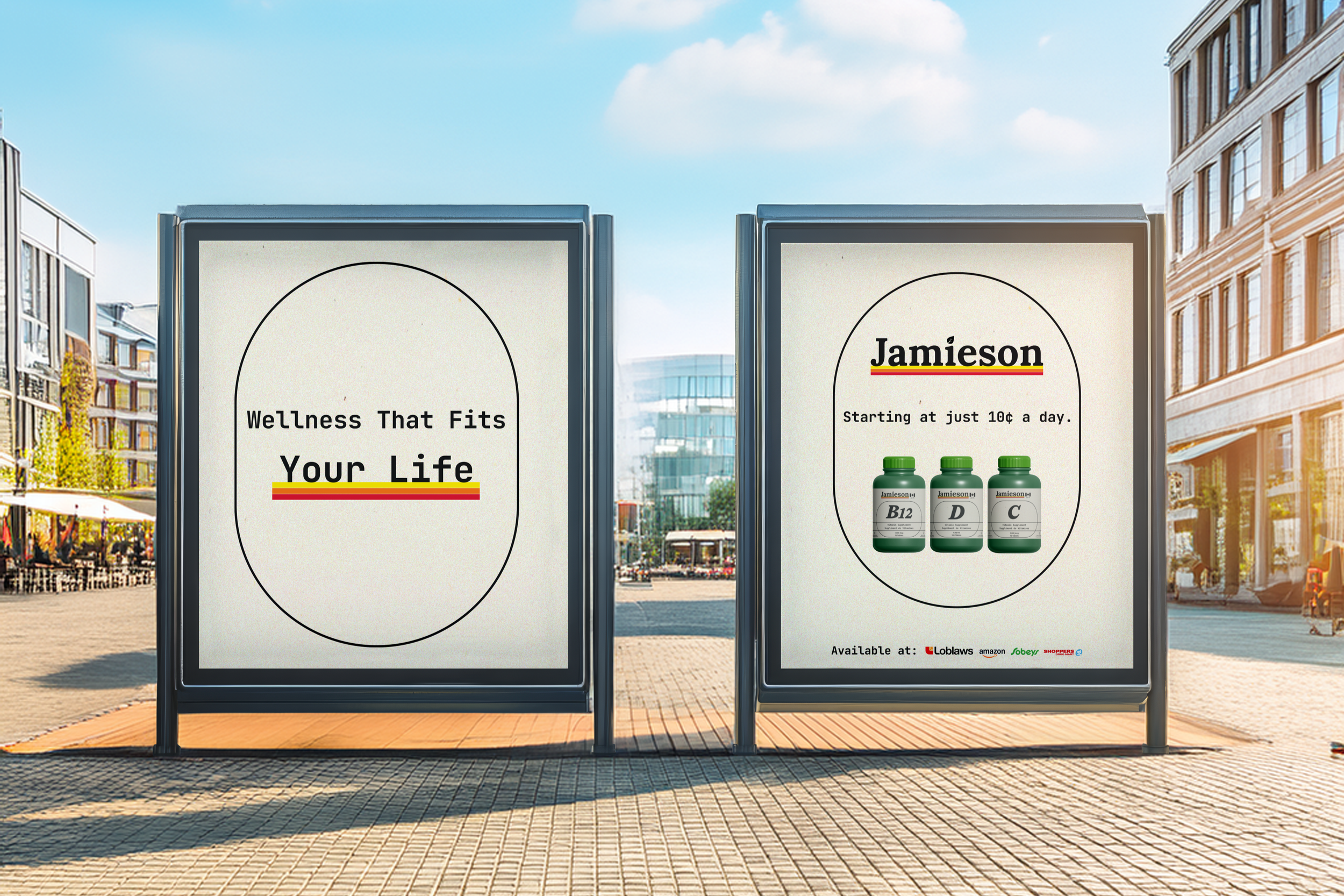
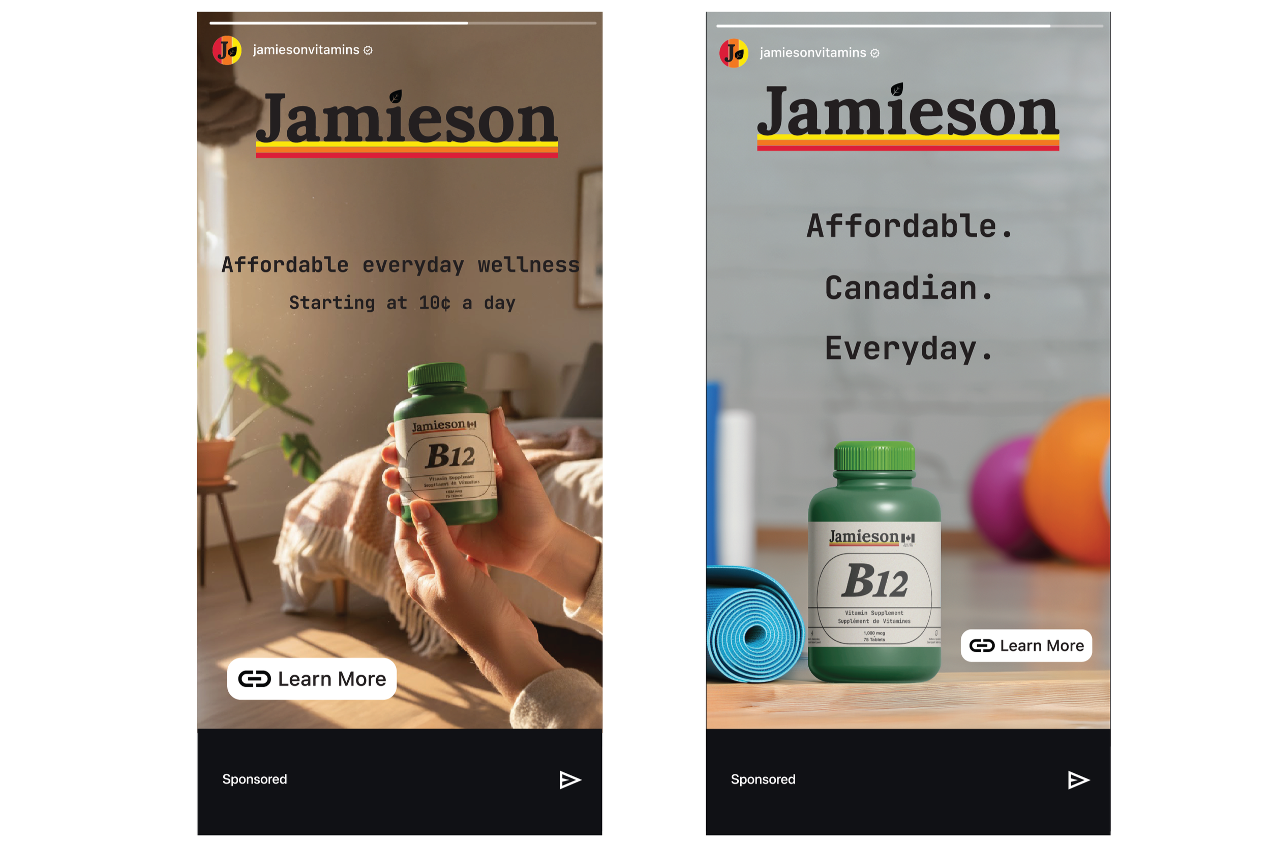
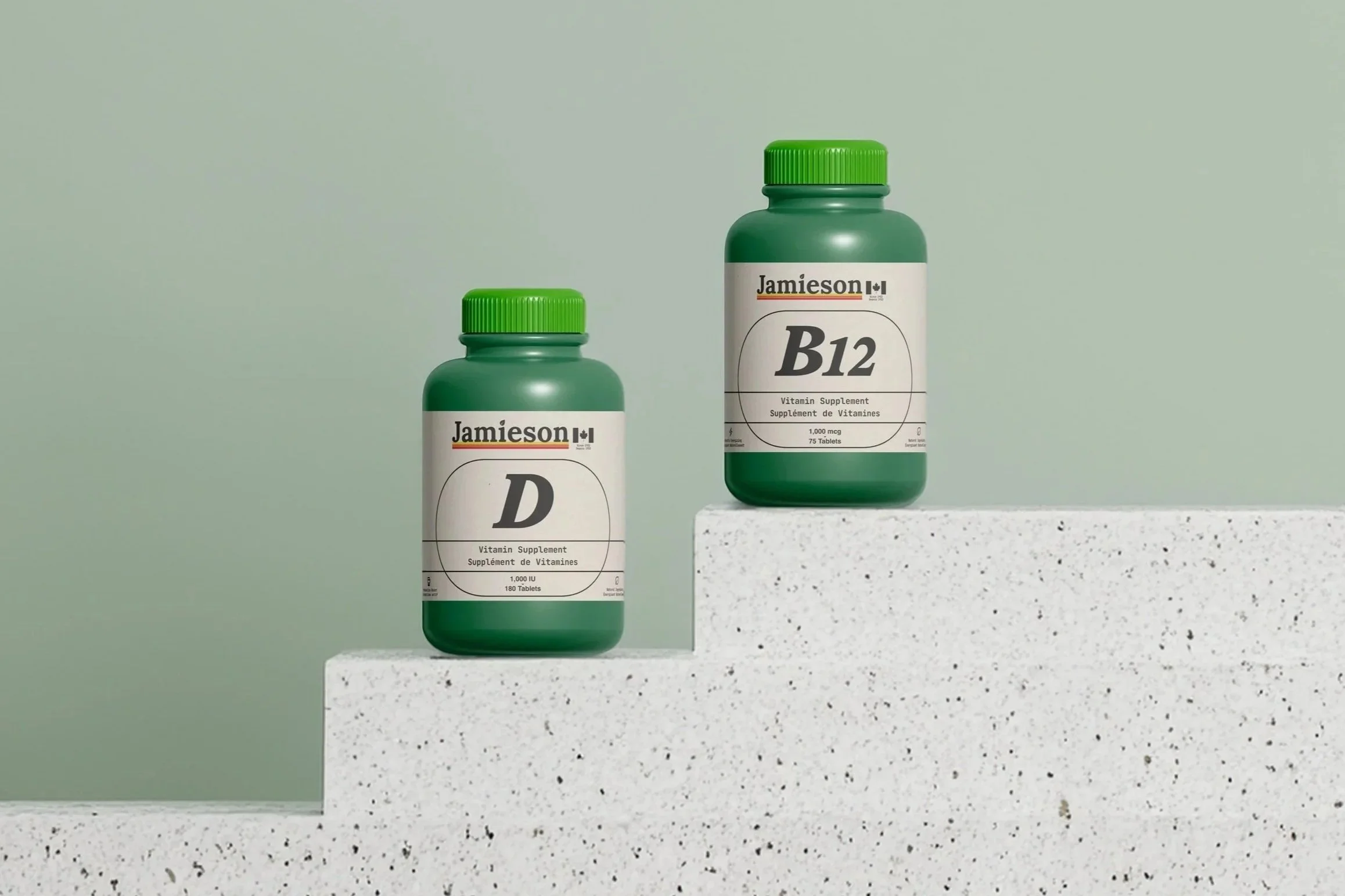
The strategy found a space between long-standing credibility and modern accessibility, somewhere none of Jamieson's direct competitors were sitting. The positioning: Accessible Wellness for Everyday.
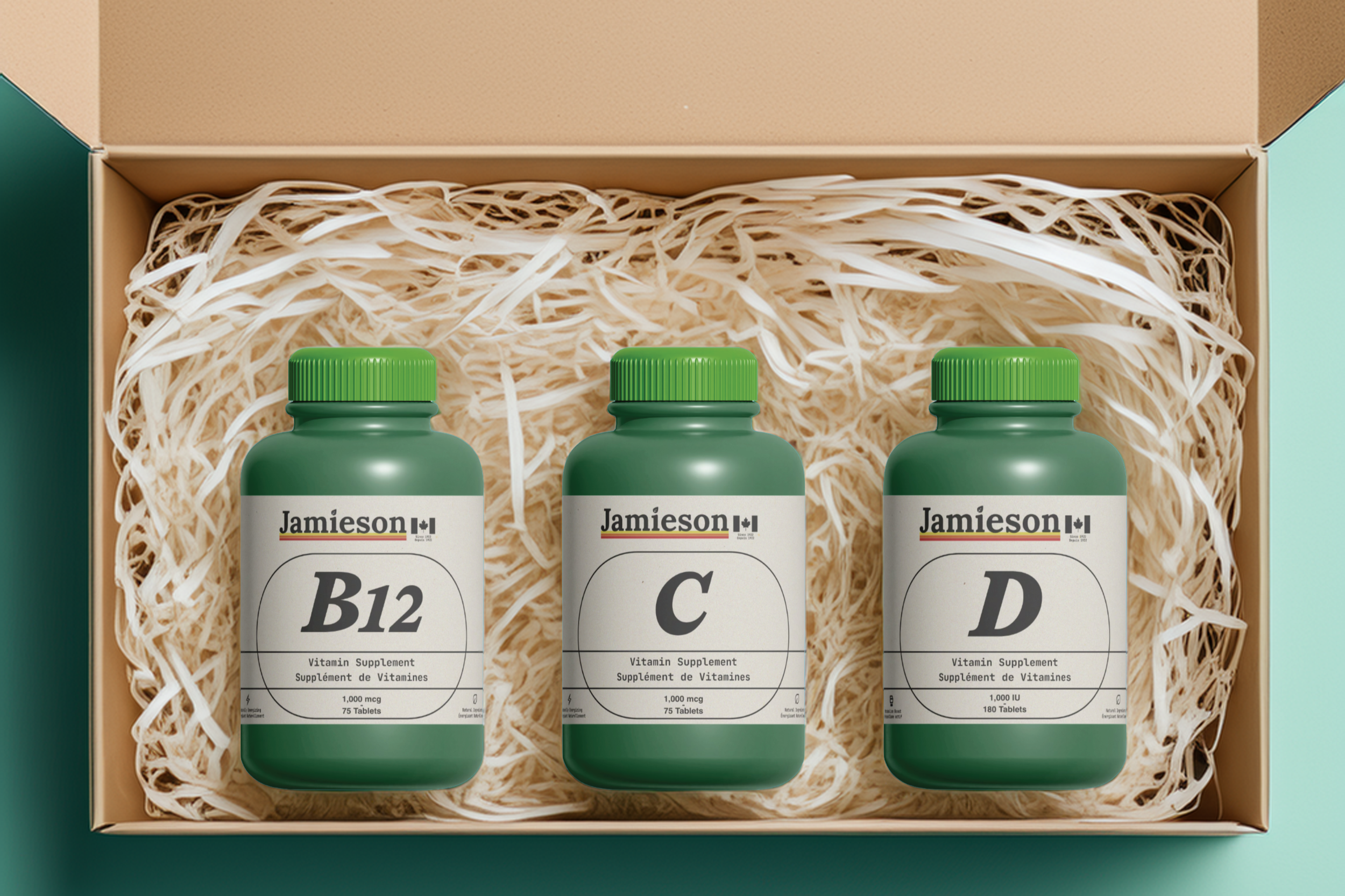
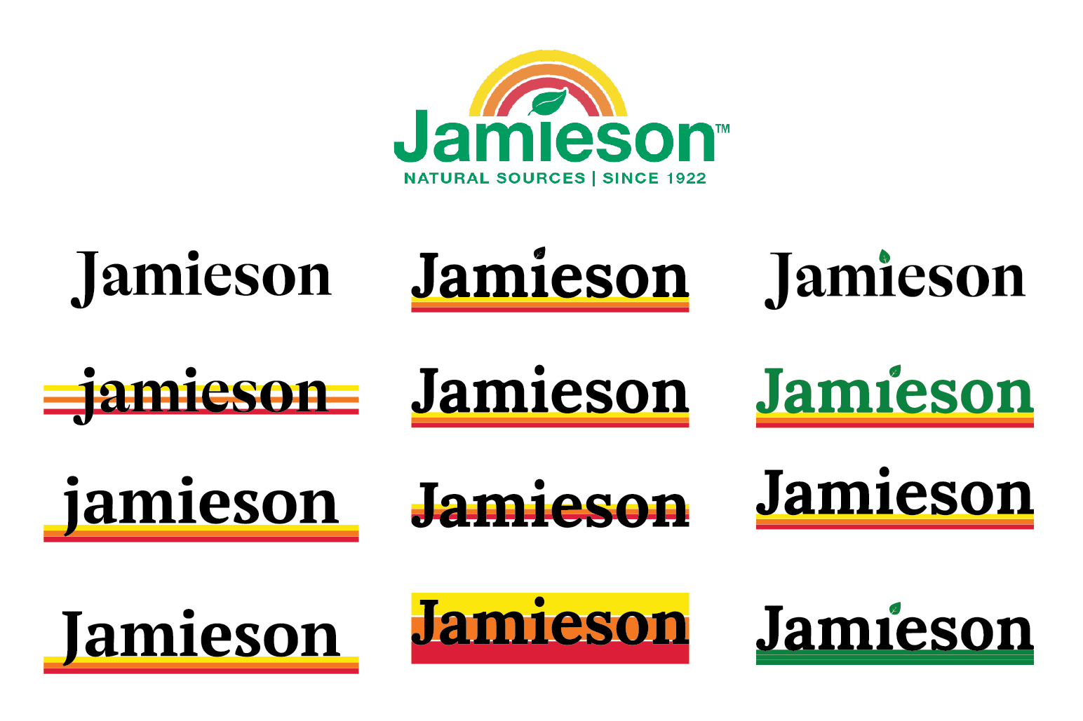
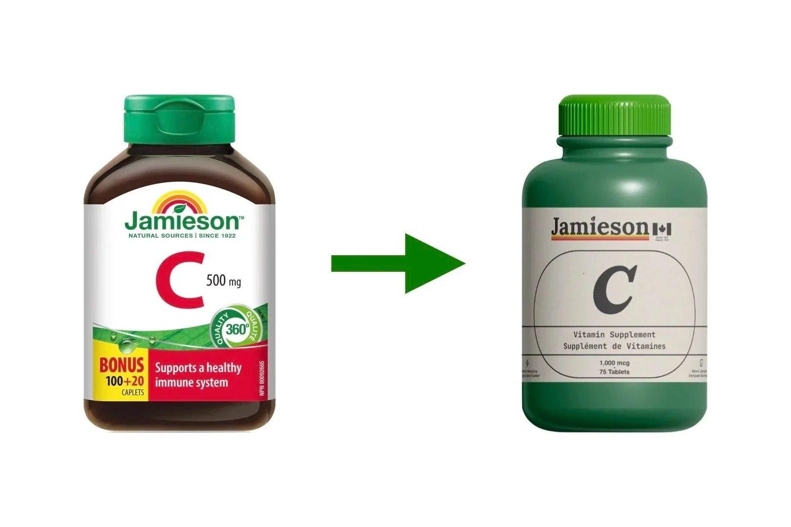
The design kept what people already recognise (the green cap, the signature colours) and cleaned up the rest. The packaging was simplified for clarity and shelf presence, with a visual language that nods to scientific labelling: clear, ordered, confident. The Canadian identity was brought forward rather than buried. Most of the competition is American. That's worth owning.